

Stamped Loyalty Redesign
Tools
Figma & FigJam
Team
Stamped Product Team
Role
Product Designer
Duration
2022-2023 Project
Stamped Platform
“Stamped is the reviews and loyalty platform for Ecommerce, helping users to establish brand credibility by building trust and giving customers a voice.”
Reviews Program
“Reviews help gain deeper insights into what customers really think and how customers truly feel about their overall shopping experience.”
Loyalty Program
“Loyalty helps acquire new customers and maximize customer lifetime value with powerful programs that perfectly fit brand needs with fully customizable AI-powered Points and Rewards, VIP Tiers, and Referral solutions.”
Problem
A significant number of Stamped app's customers have encountered challenges and issues while using the loyalty side of the application. In contrast to the positive feedback received for the reviews section, this specific area has been a source of frustration and discontent among existing users. In light of this feedback and the importance of nurturing customer loyalty, we have made the well-considered decision to give top priority to redesigning and enhancing the loyalty side of the app.
Design Process
The project design process involves defining goals, researching user needs, creating personas, sketching ideas, prototyping, visual design, iterative feedback, collaboration with developers, user testing, refining, launching, and post-launch monitoring for success.

DISCOVER: Problem
To conduct a comprehensive UX analysis, we gathered feedback directly from users, which allowed us to identify and pinpoint all the pain points in the system.
Lack of Hierarchy: Users have difficulty distinguishing essential actions and content because of the app's lack of hierarchy.
Unintuitive Navigation Flow: Users struggle to find and access different app features or sections due to poor navigation flow, leading to frustration and abandonment.
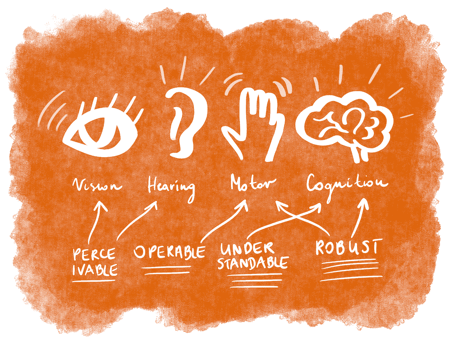
Accessibility Issues: The app overlooks accessibility, alienating potential users with disabilities and limiting its usability and reach.
THE GOAL of this project is to enhance the app's user experience by addressing hierarchy, navigation, accessibility, and brand consistency.
DISCOVER: Business Constraints
We had several business requirements:
Limited Workforce: With only 3 developers and 1 designer, efficient workload management was crucial.
Time Constraint: A tight 6-month deadline added pressure to the project timeline.
Technical Constraint: Extensive backend rewrite posed technical challenges.
Platform: Web app (desktop and mobile)
Agile Methodology: Adopted agile methodology, leveraging adaptive planning and iterative development for successful project delivery. Daily stand-up meetings ensured coordination and efficient progress.
Balancing these constraints while prioritizing a user-centred approach was critical in ensuring the success of this UX project.
DISCOVER: Research
To redesign the Loyalty program effectively and address all the problems, we conduct thorough research to gather valuable insights and make informed decisions.
Competitive Analysis: We carefully analyzed other loyalty programs and similar apps to identify best practices and potential features that could significantly enhance the user experience on our app.
Accessibility Audit: An in-depth accessibility audit of the app was conducted to identify any barriers for users with disabilities. We prioritized ensuring compliance with accessibility standards and guidelines.
User Interviews: Valuable feedback from existing customers was gathered through user interviews, helping us understand their pain points, preferences, and expectations.
Competitive Analysis
In the competitive analysis, we observed that Stamped's combination of points and rewards can be confusing for users. In contrast, Smile.io and Yotpo did an excellent job of clearly separating the two programs. Additionally, Stamped received lower ratings compared to the other two platforms. We examined the ratings' comments and found consistent mentions of issues related to hierarchy, navigation, and accessibility problems.

Accessibility Audit
Throughout the accessibility research audit conducted on the loyalty program, several critical issues were identified that could potentially hinder users, particularly those with disabilities, from experiencing a seamless and inclusive interaction with the platform.
Contrast Issues: Certain sections of the loyalty program exhibit contrast problems, such as having light text on a light background or dark text on a dark background. This can make it difficult for users with visual impairments to read and comprehend the content.
Responsiveness: Due to the absence of responsive design on both web and app platforms, users encounter challenges when accessing the loyalty program from different devices, such as smartphones or tablets.
Absence of Breadcrumbs and Back Navigation: Lack of clear navigation breadcrumbs, making it challenging for users to understand their current location and retrace their steps back to previous pages or sections of loyalty program. This lack of guidance can be especially problematic for users with cognitive disabilities or those who are visually impaired.
User Interviews
Our marketing team conducted user interviews, gathering valuable insights and concerns from existing users. These user inputs serve as a critical foundation for addressing and improving the loyalty program's accessibility and user experience.
Dead Ends in Program Creation: After creating different loyalty programs, there is no clear indication of whether a program was successfully created or saved. This lack of feedback leaves users uncertain about the status of their actions.
Unclear Display Option: When creating different rules for each program, it is unclear how they will be displayed on the merchant's website. Users are left unsure about how their rules will appear to customers, leading to potential inconsistencies.
Difficulty in Setting Rules: Users find it challenging to comprehend how all the rules should be set, resulting in uncertainty about the required information for each field. This ambiguity hampers the efficient creation of loyalty program rules.
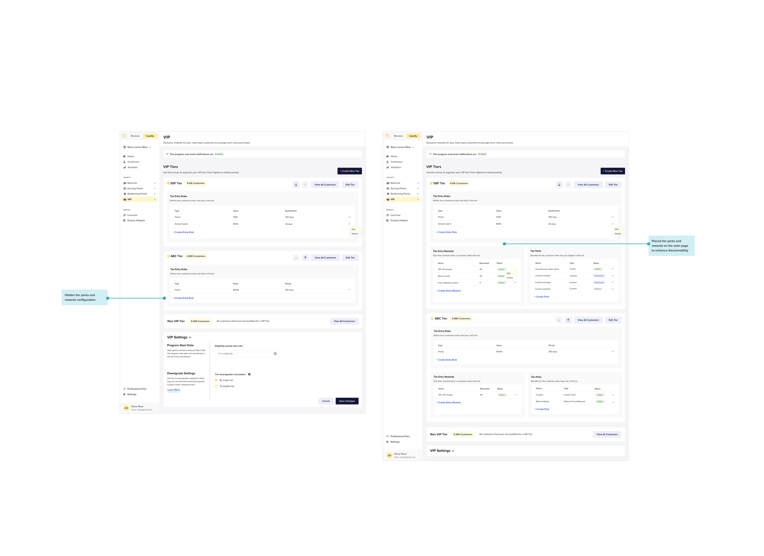
Unintuitive VIP Program Tier Creation: The process of creating different tiers for the VIP program lacks intuitiveness, particularly in creating perks and rewards for each tier. Users find this aspect cumbersome and not user-friendly.
Frequent and Easily Closable Pop-up Windows: Users encounter a significant number of pop-up windows while navigating the loyalty program. These pop-ups can be closed accidentally by clicking outside of them, causing disruptions to the user experience and leading to frustration.
IN SUM: The UX redesign of the loyalty program aims to address critical accessibility and usability issues identified through competitive analysis, accessibility audit, and user interviews. Key improvements include enhancing accessibility, providing clear feedback during program creation, simplifying rule setting, redesigning VIP program tiers, and streamlining the app flow by separating rewards and points. The redesign process will involve iterative user testing and feedback gathering to ensure a more accessible and user-friendly loyalty program, fostering increased engagement and loyalty.
IDEATE: User Flow
In our design process, we kept a strong focus on the user, ensuring a user-centric approach. During the ideation phase, we created a comprehensive user flow based on the insights gathered from our research and the essential features we identified. Our primary goal was to visualize and map out the user's journey through separate flows, including earning and redeeming rules, VIP tier setup, rule configuration, rewards and perks, and the creation of a referral program. This user flow serves as a clear roadmap, guiding designers, project managers, and developers to understand the structure and organization of the proposed design solutions. By prioritizing the user's needs and expectations, we aim to develop a loyalty program that provides a seamless and intuitive experience for all our users.

IDEATE: Low-Fidelity Wireframes
Continuing with the creation of low-fidelity wireframes, our team dedicated time to exploring various layout options, establishing a clear information hierarchy, and strategically placing content without delving into visual details. We emphasized essential components, allowing designers to focus on the functional aspects of the design. Gathering feedback and suggestions on core functionality and content structure, this approach enabled us to identify the most intuitive and efficient user interactions and user flow. As a result, subsequent design iterations were streamlined, saving time and effort throughout the design process.
IDEATE: Hi-Fidelity Wireframes
We started with simple prototypes (low-fi), but then we brainstormed and aimed for higher quality (hi-fi). Throughout the process, we kept improving and trying different versions until we achieved the best outcome. It was a journey of creativity and teamwork, and the end result is a polished and impressive solution that surpassed our initial expectations.


PROTOTYPE & TEST: Usability Testing
Following the completion of the high-fidelity mockups for the loyalty program, our next crucial step involved conducting usability testing for all aspects, including programs, rewards, points, VIP features, and referrals. This comprehensive testing phase allowed us to gather invaluable user feedback and identify any potential issues in the design. Utilizing the insights gathered from usability testing, we iteratively refined and improved the loyalty program's user experience, ensuring that it met user expectations and delivered a seamless and rewarding experience across all its elements.


FINAL MOCKUPS: Main Features
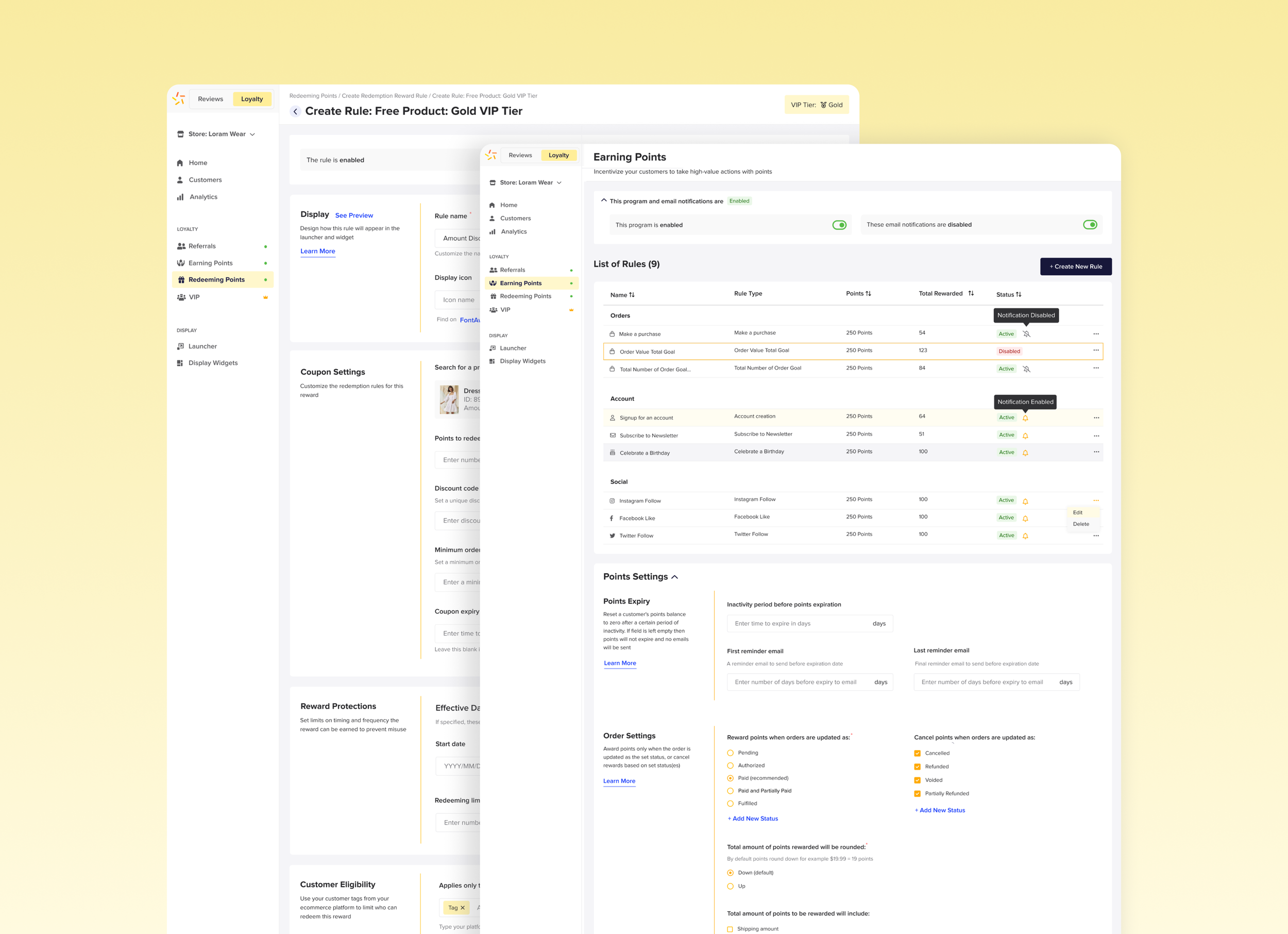
Earning Points Section
Our refined loyalty program introduces a dedicated "Earning Points" section. This streamlined interface allows easy rule creation, transparent rule tracking in a table, and the flexibility to enable or disable the program as needed. It's a dynamic and user-centric approach to enhancing the loyalty experience.

Redeeming Points Section
Within the loyalty program, we also have a dedicated "Redeeming Points" section. This user-friendly interface allows easy setup of reward rules, transparent tracking in a table, and the option to enable or disable the program as needed. Experience a streamlined approach that enhances loyalty benefits.

Rule Creation
Creating rules for the points and rewards sections becomes a seamless task through a user-friendly process. By filling in essential fields, even intricate specifics are covered with accessible documentation. The system ensures that saving your rule is never missed, employing a helpful pop-up reminder. Importantly, navigation buttons stay anchored at the screen's bottom, providing effortless access and a consistently intuitive experience.

VIP Section
Within our VIP program structure, we've established distinct tiers. Each tier offers the ability to craft rules, perks, and rewards tailored for users. This approach ensures a personalized experience and meaningful engagement at every level of the VIP journey.

Referral Section
Enabling customers to refer their friends and earn rewards has been thoughtfully designed for a seamless experience. Our system offers a straightforward configuration, allowing each customer to refer a friend and receive a reward. This user-centric approach ensures simplicity, with a single reward allocated for each friend and customer, enhancing the overall usability of the process.
