
Stamped Design System
Tools
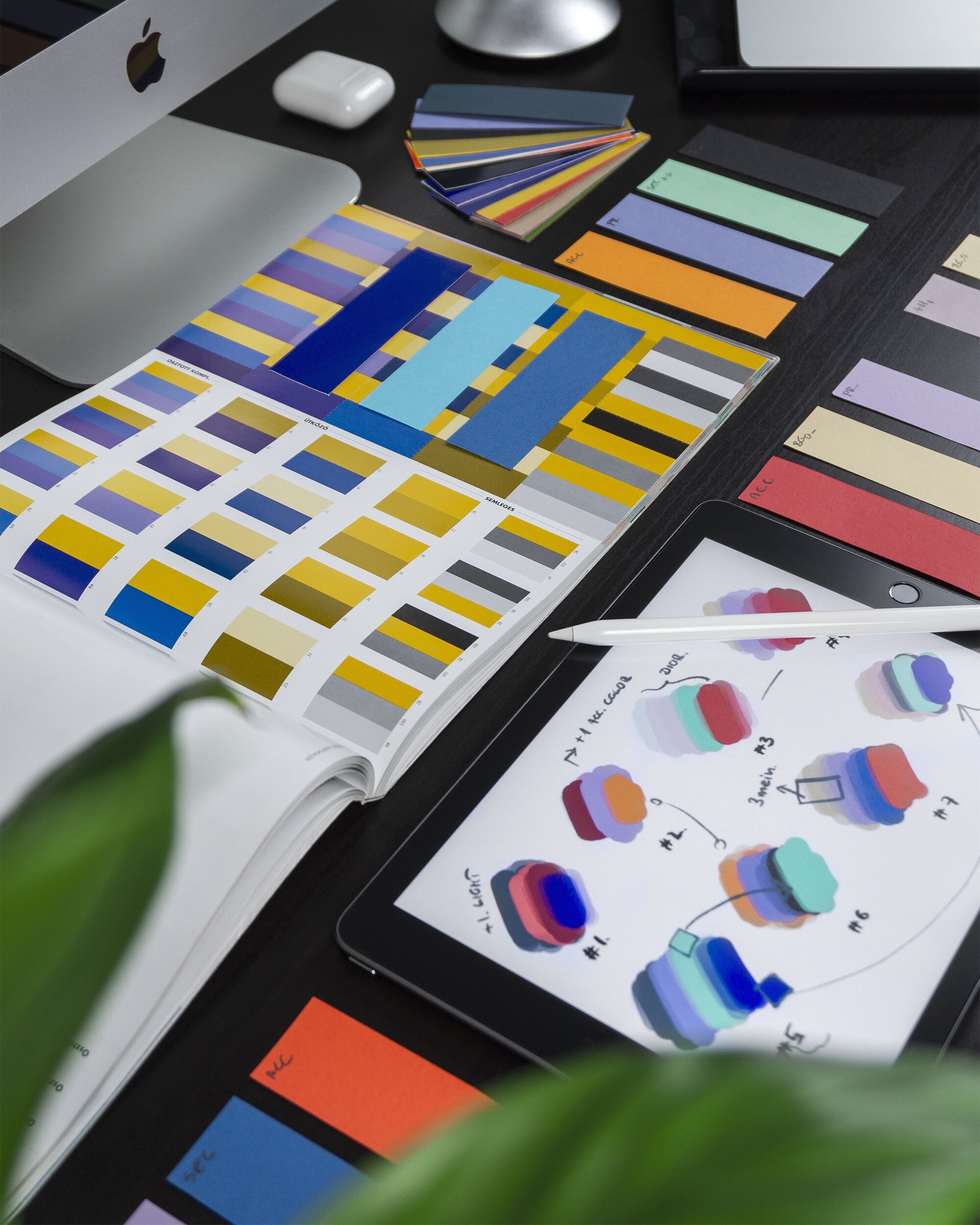
Figma & FigJam
Team
Stamped Product Team
Role
Product Designer
Duration
2 months (2023 Project)
Project Overview
A design system is a collection of reusable components, guided by clear standards, that can be assembled together to build any number of applications, and the need for them goes hand in hand with the need for scale, efficiency, and consistency in Design. They basically bring order to chaos.
I created Design System to create that order at Stamped. In this project, you will see all of the components that I created. Overall, a design system is much more than just a component library, if built correctly it is the lifeblood of your products.
Problem
The absence of a formalized design system was evident in Stamped's setup, where the website and the product functioned as distinct entities, lacking uniformity in terms of brand presentation, colour schemes, and UI elements. This resulted in a lack of consistency across the platform's visual identity and user interface components.
Challenges:
Conflicting guidelines cause confusion
Duplication of common components
Inconsistency between the website and product design
Pressure to adopt agile solutions without proper discovery and research
Teams operating with limited communication
Goals:
Global - In light of our team's composition of 60 members spread across diverse countries and time zones, the challenge is to devise a system that seamlessly accommodates these varied teams. This system should have the adaptability to extend its benefits to websites, marketing components, and our two unique products, ensuring a cohesive user experience throughout.
Accessible - Recognizing the diverse nature of accessibility compliance laws across various markets, our intention was to center our system around the universally acknowledged Web Content Accessibility Standards (WCAG 2.1). This strategic approach underscores our commitment to ensuring an inclusive digital experience for all users, regardless of their abilities or geographical location.
Flexible - Embarking on the task of harmonizing component flexibility and structured agility, we endeavored to create adaptable elements that seamlessly aligned with our agile development process. This entailed striking a harmonious equilibrium between design versatility and cohesive solutions, all with the intention of cultivating agile-friendly user experiences capable of evolving seamlessly within our iterative methodology.
The absence of a design system results in a disjointed user experience.
Foundation
As I see it, building a design system is similar to constructing a house, you cannot start without laying the foundation. In design systems, the foundation is created using a spacing and grid system, which are frequently overlooked. I believe that paying close attention to these elements can make a substantial difference in a design's overall look and feel. Therefore, I always ensure that the spacing and grids in my design system are well crafted, as they play a vital role in the success of the final product.
For this project, I went with an 8pt grid system that consists of a 12-column grid. For the spacing system, I went with a rem-based guide that aligns with the 4px grid. The reason why I went with a 4px system is to help the design system be more responsive because all of the top screen sizes are divisible by 8 on at least one axis. This is important as it will help prevent anti-aliasing.

Typography
My selection of Gilroy and Proxima fonts for my design system was based on their geometric letter shapes and well-balanced character spacing, which provide an ideal combination of legibility and aesthetic appeal. These fonts also offer a range of weight variations that make them highly adaptable, and equally suited to use as both heading and body text. Overall, their versatility and visual appeal made them the perfect choice for my design system. Both fonts work well for mobile and web applications.

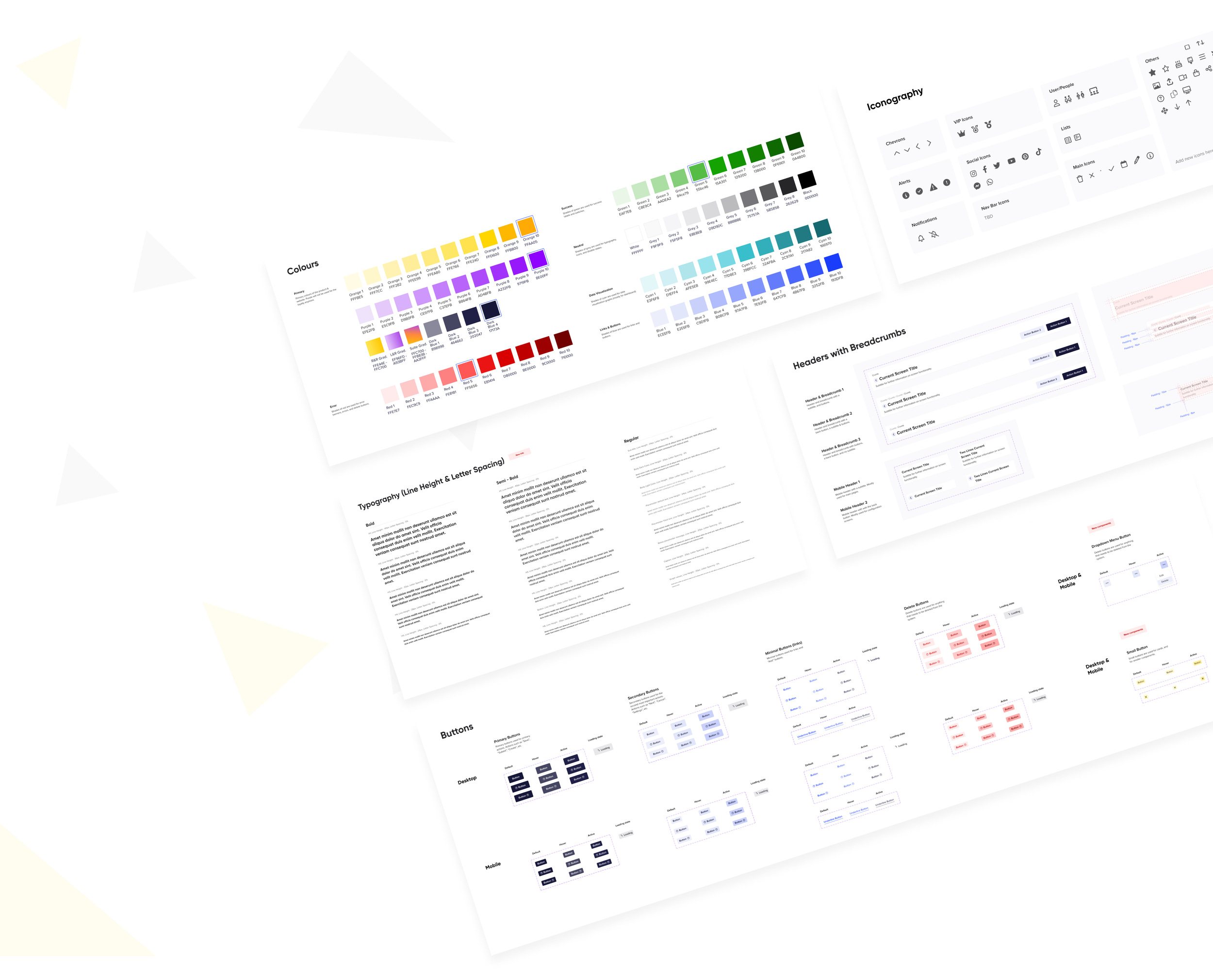
Color Palette
In designing the colour system for Stamped, my top priority was to ensure that it supported clear communication and enhanced the overall user experience. While aesthetics are certainly important, I believe that colour choices should be made with intention and purpose, based on the specific roles that each colour plays within the interface.
By taking a thoughtful approach to colour selection and defining clear colour roles, the Stamped design system is able to support effective communication and enhance the usability of the interface.

Iconography
I chose to use the FontAwesome icon library for Stamped iconography. I went with the FontAwesome icon library because it's simple, informative, and complements the overall visual language of the design system. I went with a regular icon set because detailed icons increase cognitive load. By prioritizing simplicity, I aimed to make it easy for users to grasp the concepts represented by each icon, even on smaller screens where visibility may be limited. Overall, FontAwesome was the perfect choice to enhance the functionality and usability of the Stamped design system.

Buttons
While most people understand the concept of buttons, non-designers may not be aware that a single button can have multiple states, including active, hover, focus, disabled, and occasionally, a loading state. In the Stamped design system, I incorporated all five of these states, as well as six different button types: Primary, Secondary, Minimal, Delete, Dropdown and Small buttons. Each button type also has an associated icon version.
By including these variations in the design system, Stamped can provide a more comprehensive and versatile user interface that is better suited to meet the needs of different users and use cases. Below, you can see examples of some of the buttons in different states

Form Fields
I created various different components for Stamped, and among them, the form fields were a major category. Similar to buttons, form fields also require the ability to adapt to various states. While designing these components, accessibility is a critical factor that I prioritize. It's crucial to ensure that the field's label remains visible when selected and that there are multiple indicators, not just colour, to indicate errors.

Other Components
I created numerous other components that I would like to share to provide a more comprehensive overview. These additional components have been specifically designed to support the Stamped marketing team and Stamped Loyalty application.


Implementation
To implement the components I created, the development team followed the guidelines and specifications I provided. They used front-end technologies and ensured the components were responsive, compatible, and optimized for performance. We worked closely together to meet the design requirements and deliver high-quality work.
